


One thing we see often when we work with business professionals on their PowerPoint presentations is that the typical slide tries to tell too much. Their intentions are good but these intentions tend to backfire. They want to be complete, detailed, and accurate. They want to tell the whole story and not leave gaps. However this overwhelms the audience and causes them to "check out"! You probably heard about the death by PowerPoint.
When the audience are subjected to this slide, are they going to see the completeness, the details, and the accuracy. Unfortunately not! This is what the audience is more likely to see:
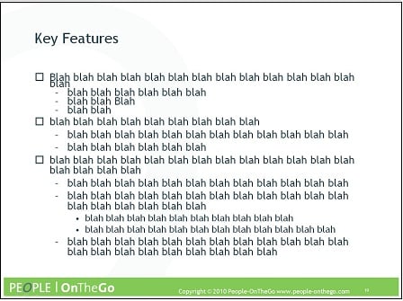
You lost them right away! And now you have to fight to win them back.
Here is one of approaches that we teach to help eliminate the PowerPoint clutter, avoid losing the audience, and get them curious and engaged instead. This approach is called "breaking down the content." Here are the related steps and a couple of illustrations below:
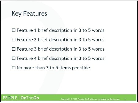
- Reduce the slide to the core messages; ideally 3 to 5 of them, expressed in 3 to 5 words each. Let us call this the "3x5" rule. This leaves the audience curious. It opens up the room for reflection and then conversation.
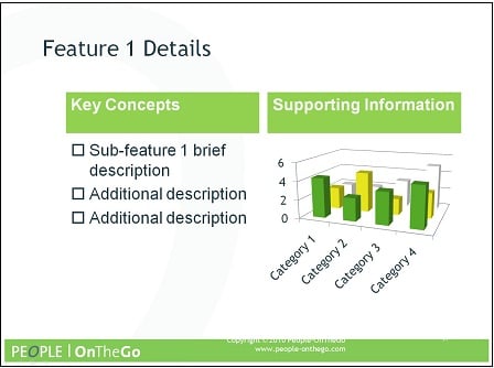
- If some of these core messages require additional details, create a separate slide for this core message, following the same rule (3x5 rule). However use these detailed slides if and when necessary; right when the situation calls for it.
- Balance between text and visuals, and select your visuals carefully. Visuals need to be relevant, simple, and clear. They should easily convey the point instead of making the audience think or wonder.
The reduced slide might look like this:
The slide that expands on feature 1 might look like this:
Stay tuned for more PowerPoint and presentation tips this week, including the complimentary lunch & learn webinar about Microsoft PowerPoint 2007 Techniques this Thursday January 28, 2010.

